Vietnam: 50 years later, the potency of the literature and film endure

I wouldn’t begin a post like this any other way than by honoring my father, Bill Roback, for his service to our country in the Vietnam war as a sergeant in the Army combat engineers. He courageously served in the war, earning the Bronze Star, and was honorably discharged following his two years of service. Dad, there are many stories I could share on your behalf, but I’ll just say this: Thank you for all you have done.

I also recognize my father-in-law, Dan Ortegon, for his service as a sergeant in the Army in Vietnam. Thank you.

This year’s Veteran’s day marks the official beginning of our country’s commemoration of the 50th anniversary of the Vietnam war. The best way that I feel I can commemorate the occasion is by discussing the potent art and literature produced both during the time, and by veterans recounting their experiences. I am by no means an expert, but I have read my fair share (especially under the teaching of James Fairhall, a veteran, scholar, and tenured professor of literature at DePaul Univeristy, Chicago).

So here is a course in Vietnam War literature if you are interested in learning more about the bravery, sacrifices, and also the failings of our country, both in terms of foreign policy, and failing to honor our veterans with the respect they deserve upon their return.

Stanley Karnow, Vietnam: A History
Even if you know something going into the reading, Karnow’s text is the definitive history of the geopolitical strife and international politics surrounding the war. It is a classic example of “great man” history in that it mostly ignores the “boots on the ground” perspective, but it is a primer that allows you to approach the real accounts with some semblance of overview. The war is an intensely personal experience for those who lived and wrote about it, and this text will help you to navigate that experience as well as understand the context of their writings. At over 700 pages, it is a tome to be reckoned with, but I recommend it to anyone before and/or after diving into the personal narratives.

Oliver Stone (dir.), Born on the Fourth of July, the first 90 minutes
Stone’s biography of Ron Kovic, who fights and is paralyzed in the Vietnam war, delivers a powerful message about the patriotism of post-World War II and how the spirit of that era carried over to our involvement in the Vietnam war through a parable (or perhaps truthful biography) of Kovic’s life. The film dramatically captures the transition from post-war enthusiasm to the traumatic cultural amnesia of the post-Vietnam era (the scene with Kovic [Tom Cruise] and his mother highlights the extent to which people were willing to go to forcibly forget the costs of the war). After that scene, the film becomes pointless and self-indulgent, but the first 90 minutes are a primer on the change in cultural values in America from the 1950s to the 1970s.

Graham Greene, The Quiet American
Both a poignant anti-war novel and a critique of (imperial newcomer) American involvement in Vietnam, the novel begins the tradition of painting the Vietnam war as a conflict without winners. The protagonist of Greene’s semi-autobiographical novel both revels in colonial excess while simultaneously being aware of (and full of self-loathing regarding) Europe’s transgressions, all the while angrily opposing America’s proxy (a thinly veiled CIA operative) as an unwarranted intrusion into the affairs of the region. It’s a masterful depiction of a man/nation/continent who have all done wrong (admitting it to themselves), while angrily establishing their own territorial domain over doing wrong in the region. Much like the denizen of the downtrodden city, the unwanted tourist is still the real enemy.

Tim O’Brien, The Things They Carried
O’Brien’s fictional memoir belongs here as a reminder that truth is subjective. There is no reason to believe anyone when they claim to represent the “truth” of the Vietnam War. As O’Brien reminds us, the truth of a shitty situation is often buried in the “shit” where it belongs. What we get are the memories of men and women, filtered through how they remember events, for better or worse. While this collection of stories is not the definitive Vietnam War novel, it is critical to read in order to orient one’s self to the mutable nature of war narrative. Detractors will say the book is self-annihilating and ultimately meaningless, but there is a salvation in the pages that allows us to recognize the fallacy of the “glorious war narrative” and still retain the redemptive nature of service, sacrifice, devotion, and, finally, human emotion and memory.

Oliver Stone, Platoon
Stone’s better, first film about the Vietnam War depicts much more of his own personal, lived experience than his later film. Here we see that no battle is glorious, and that the heroes of this war are the persons who (tried to) keep their decency and humanity among carnage and brutality. No one is without the scar of immorality in this film, but there is a powerful catharsis if you can stick it out and empathize with the imperfect protagonist.

Ray Kellogg and John Wayne (dirs.), The Green Berets
In an effort to turn Vietnam into a replica of World War II’s clear cut morals, John Wayne himself steps in as the unquestionable moral authority and leads a team of crack commandos in a clear cut, conventional fight against an easily recognizable enemy. Universally lambasted by critics as a totally unrealistic portrayal of the experience of soldiers in the Vietnam War, the film was purposely designed to give the public back home a positive image of the war and drum up support. It is a good contrast to the brutal reality of Stone’s Platoon and O’Brien’s The Things They Carried, demonstrating that Hollywood in the late 60s was just as aware of image enhancement as they are today.

Le Ly Hayslip, When Heaven and Earth Changed Places
It seems reductionist to say “read one memoir by a Vietnamese refugee so you get a balanced perspective” but I have not had exposure to many books like this. I will say you must read this book to understand some of what it must have felt like for Vietnamese persons during the war, but this can obviously not give you every perspective. Oliver Stone made a poorly received film for the above reasons in 1993 that I have not seen.

Bernard Edelman (ed.), Dear America: Letters Home from Vietnam
For your final three books, begin with this compilation of letters home from GIs. You’ll find in them the despair, triumph, vulgarity, hatred, fear, and transcendence in war expressed by the men and women who fought and risked their lives. I typically associate the American Civil War with eloquence of the daring and dangers of war, but this collection demonstrates that the horrific insight of the battle wary (and weary) belongs to all generations.

Tim O’Brien, If I Die in a Combat Zone, Box Me Up and Ship Me Home
O’Brien’s autobiography not only documents his time in basic training, his brush with conscientious objector status, and his reluctant but valiant service in the military, but also questions the nature of courage and how one comports oneself in battle with how we view courage as a society. While his fictional memoir, The Things They Carried tries to make you feel his lived experience, this text is a critical examination of the concepts of courage, battle, and what it means to be a man. His profiles of fellow soldiers and accounts of lived experiences pair nicely with his fictional memoir, and they should not be read separately in my opinion.

W.D. Ehrhart (ed.), Unaccustomed Mercy: Soldier-Poets of the Vietnam War
The War in the words of the warriors who fought it. What else can you say.

Post Script: Bobbie Ann Mason, In Country
A post-war pilgrimage by a daughter to commemorate her father’s sacrifice at the Vietnam Memorial in Washington D.C., this novel often times comes off too sappy and too obvious, but resonates with the children of a Vietnam vet both in the pop culture references and the multiple surrogates for variously adjusted vets in the town, who meet and poignantly discuss the war. W.D. Erhart provided the technical descriptions of war for the book, but there are critics who complain of the lack of physical injuries (e.g. Ron Kovic’s injuries) in the veterans in the book.

***

I hope these texts are a good introduction to this subject for you and honor the memory of the sacrifice that our fathers and mothers made in their youth to protect our freedom while also allowing us to reflect on our civic responsibility to hold our government responsible to the will of the American people.

Happy Veteran’s day to all of those who served in the armed services for our country. Thank you for your service.
User experience nightmare with car controls

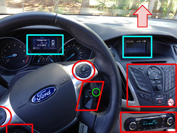
This was probably one of the worst designed user interfaces I have ever experienced. I rented an economy car for the conference I was at last week and I was upgraded to this car, the make of which is readily apparent from the photo and the model of which is a synonym for concentration / what you do to a projector to make the image clear. Have a look at the annotated user interface: displays are bracketed in blue, buttons in red, and the red arrow indicates where a whole other bank of buttons was located out-of-frame on the roof of the car). Click for a larger image.

Having done some research on eye-tracking devices (the research tool that you strap to someone’s head to see exactly where they are looking at on a display), I know that the human gaze can only truly focus (no pun intended) on an area about the size of a quarter (the $0.25 coin) held at arm’s length. So while this photo is a pretty good representation of my view from the driver’s seat, you can imagine the focus area as that green circle towards the bottom center.

That green circle has another meaning, as it highlights the button you push to engage the voice command function in this car. I tried using this function to turn on the radio as I drove to the airport, as pressing the “RADIO” button on the large center console in the right of the photo does nothing (I missed the tiny on/off toggle label on the button protruding from that console).

That voice function has absolutely no natural language processing ability, and it also only controls a finite number of car functions that it lists off after you fail to issue a recognized command. It apparently thought I wanted to make a call, and kept asking me for a number. I am a tightwad, and I can only imagine the cost of making a call from a rental car, so I was frantically trying commands like “OFF!” and “Never mind!” that my iPhone recognizes, but this car jovially disregarded as it continued asking me for clarification. I was also driving on unfamiliar roads at the time and missed my turn, making the situation a complete debacle as I awkwardly tried to turn around in a shopping mall parking lot while arguing with my car, holding up traffic and probably enraging the local drivers.

So here are some unorganized observations. First, there should only be one display for the driver to look at: the one between the tachometer and speedometer on the left. The center display is a terrible distraction. Why the hell there are directional pads on either side of the steering wheel is a mystery; perhaps they are trying to accommodate right-handed and left-handed drivers? Either way, you cannot keep your eyes on the road when you are trying to move a cursor on that display. The bank of controls on the ceiling (where the arrow is pointing) operates the interior lights, sunroof, and other features, and is equally difficult to operate while driving. There are also thumb operated switches on either side of the steering wheel that operate the phone, stereo, and cruise control. These are better, and maybe one grows accustomed to the functionality over the course of ownership and with some practice (you need to hold down buttons in different time intervals apparently to select and execute the desired function).

Add to that the odd placement of some things: the door lock is a button on the center console (the one with the small orange LED), which was nearly impossible to find. On either side of that are switch-style buttons with no other label than a short line and a slightly curved line that had no function as far as I could determine (they did not control the mirrors as I first thought; there was another directional pad/switch combo on the door handle that did this job).

While in the car, I had the impression that I was piloting an F-22. I usually laugh at people who are afraid to “break” systems or who become button shy, but I was humbled by my experience in this vehicle. My own car is a warhorse with very few frills, so getting in this relatively high-tech machine was an assault on the senses (I say “relatively” because I know there are much fancier cars with even more buttons). The interface design almost assumes a passenger (or dare I say, co-pilot) to operate and monitor systems while one drives. Doing so on your own as the driver is perilous (especially when you are driving a rental in an unfamiliar city). I should note that I was also trying to use my phone’s navigation function at the time, which only added to my distractions.

The answer to the cognitive overload I experienced is obviously that little green circle. If the computer actually processed natural language and not preprogrammed speech acts, and if it controlled more of the car’s auxiliary functions (other than the primary function of driving) you could eliminate two-thirds of the buttons in those red boxes.

On public transit design, and the new CTA 5000 series rail cars

If you haven’t ridden the rails in a while or if you’re not served by the Pink or Green line trains, chances are you may not have experienced the new 5000 series rail cars yet. Opinions are squarely split down the middle on the configuration of the seating, but there are some other aspects that aren’t getting much attention that I wanted to talk about here. First some background.

The new rail cars seem to be part of the CTA’s effort to bring our heavy-rail transit system up to the standards that Washington D.C.’s Metro system set in the 1970s. On the system end, Federal Transit Authority and American Reinvestment and Recovery Act dollars are helping to remove slow zones on the Red and Blue lines (the backbone of the city) and take the Brown line (Lakeview, Wrigleyville, Far Northwest Side) out of the 1930s. Also, the CTA finally has tracking equipment/software with an API that lets developers create applications to gauge arrival times. At most rail stations and some large bus kiosks, arrival times are also on large LED displays, which is a huge humanitarian improvement for everyone as individuals can finally estimate approximate arrival times without a phone.

Judging from my past experience, the CTA doesn’t typically handle communication with customers too well in the case of catastrophic rail delays (e.g. train fires, derailments, police action, etc.), as I have often entered subway stations or boarded stationary trains and sat there like an idiot waiting for service to resume without a word from employees over the PA system. However, since smart phones have become more common, they have made a good effort to allow developers to take whatever information is available and distribute it via apps (sadly, the CTA’s own web interface is frequently broken). Also, I have heard that under the presidency of Forrest Claypool there is a huge push for customer service, courtesy, and cleanliness.

Now, on to the new rail cars. The CTA is getting several hundred at the cost of $1.14 billion dollars, which I guess is a steal. Apart from the seating, which I will get to in a minute, there are some other changes.

Usability enhancements such as LED information screens (which display the next stop and the current time) are at both ends of the rail cars and there is now a flashing light that blinks when doors are about to close. While these are necessary improvements for persons with low or no hearing, they are convenient for all riders.

Now, on to the most comical of the enhancements, the light up system map that reminds me of two things: something out of Epcot center in the 1980s, and the map of nuclear power plants in Homer Simpson’s office.

I have bracketed the red LED that indicates the next stop (bottom right) because it is almost impossible to see at any distance. My very first thought was “What the hell are they going to do if a new station is added or a station is shut down?” and I have yet to come up with an answer. I guess they will have to either replace those panels or drill some holes and slap on some stickers as the transit system changes over time. More importantly, the map is located at the midway point of the car on only one side, which will be functionally invisible to most passengers on a crowded train (I myself noticed it only on my second ride). It’s an odd decision at best, and an expensive boondoggle of a bureaucrat at worst. At least there is a clout job in it for someone to change all those tiny lights as they burn out (if anyone from CTA is reading, I have experience installing light bulbs and, yes, I am interested in a high paying job replacing those lights).

Onto the seating configuration. The entrances are now free from seats as well as the highly unusual divider that is still present on some Blue line trains which divides the two folding doors and prevents anyone from entering/exiting comfortably. It makes much more sense to have that area freed up, both for persons in a wheelchair and for persons who want to stand with bikes; likewise, you can fit many more passengers in that area. On my rides, however, I noticed that passengers tended to congregate at the entrances still. This must be force of habit, as the cars have many more convenient handholds in the form of vertical poles and dangling loops in the interval between the doors. Lines on the floor clearly demarcate where standees should be in order to keep the isles clear, which seems like a small thing, but is important nonetheless. Consider when you line up at a bank of self-checkout kiosks at the supermarket: there is a great deal of confusion, anxiety, and frustration when it is not clear where you should be standing (for conscientious individuals at least).

The seating is similar to what I experienced in Boston: aisle-facing bucket seats. From what I hear, in New York the heavy rail has aisle-facing bench seating (New Yorkers feel free to correct me). Anyone who’s sat in a bench seat in a car knows the downside: when a turn happens, you slide right into the person next to you. The disadvantage of bucket seats is that there are discrete spaces you can occupy, which means you’re probably rubbing shoulders with the person next to you. Neither is ideal, but benches at least give people the option of spacing things out themselves (with or without bags and parcels) as opposed to bucket seats in banks of three (vertical poles separating each bank), which are pretty rigid on how much space you are occupying and how you can sit. I suppose like most public seating, benches encourage people laying down, which is a serious issue as homeless people looking for a comfortable sleeping surface and jerks looking to take up all the seating space will be all over that. Seat dividers ultimately keep people upright.

My suspicion is that if there were more outreach on the part of the CTA as to the layout of train seating, people would have a much easier time accepting the configuration. The CTA usually follows the bare minimum of public feedback: a few public hearings at inconvenient times/locations and some vague announcements buried on their website and in small print on 8.5×11 sheets on buses.

Even though we are stuck with the seats we are given, I know that city residents are not modest about their opinions on public transit decisions, so I encourage you to tell me and the CTA what you think about the Railroad of the Future.

*Sorry I do not have more pictures. I don’t have time to photoshop out faces. If you want to see the whole interior of the car, here is a pretty good image of what the whole rail car looks like.

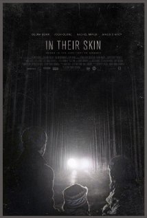
In Their Skin (2012)

Dir. Jeremy Power Regimbal, 97 min., Canadian (with some odd pronunciations, eh?), at the Chicago International Film Festival

Nicole and I managed to wedge in one more film from the CIFF, and what a surprise, it was another horror film.

In Their Skin tells the story of the Hughes family, who has just recently lost their young daughter. The father, Mark (Joshua Close) and mother, Mary (Selma Blair) have a marriage that is reduced to shambles, and a trip to their swanky cottage out of season is clearly the last attempt at salvaging their relationship and family (they have a young son).

After arriving, Mark encounters an oddball “family” inexplicably stocking the woodpile outside his back door at the crack of dawn. After a tense encounter, Mark invites them over for dinner along with his brother (apparently trying to interject anything and anyone into the mix to dispel the unbearable tension between himself and Mary). At the dinner, it becomes clear that the neighbors they have invited into their house are not in the same social class by a longshot, as they ask question after uncomfortable question of them, including such class reminders as “How does someone get a house like this?” and “I’ve never had dinner with a lawyer before,” etc. The situation escalates until you have a standard, though slightly amped up version of a home invasion thriller.

In the Q and A following the film, Regimbal made it clear that the class difference was central to the architecture of the plot, yet I found a bit of fault in the standard privileged urbanite=good/victim versus hillbilly=bad dichotomy that this film perpetuates. Coming from a small town, not everyone is a deranged hick waiting to violate and kill your family, I promise. Most horror films tend to desperately cling to this mantra, and this film does little to challenge it; there is a lackluster attempt to prove that rich urbanites are not perfect, but mostly they struggle with “rich person problems” while the crazy hicks act all stupid crazy.

In our post film discussion, Nicole pointed out to me that there was a lot of subtext about identity and how people freely give away information, which in itself is a huge anxiety explored in horror films. I admit I missed that subtext a bit, and that dimension salvages the film for me. The original title of this film was Replica, which makes sense given the later revelations of the antagonists with respect to identity theft. I suppose that a rewatch might reveal that the initial conversations which appeared only as odd might in fact contain a great deal of suspenseful probing as Nicole suggested.

And, as it happens, a rewatch (or first viewing in your case) is not out of the question as the film will open next month in U.S. and Canadian markets. To me, the film was strongly reminiscient of Cape Fear (1991) in many of it’s plot points. Also, Rachel Miner (who plays the crazy lady) appears to have taken lessons from the Juliette Lewis school of acting. I also heard Funny Games (2007) bandied about during Q and A, though I haven’t seen it. If you are into home invasion thrillers, this film is a solid entry with some interesting subtext that offers a slightly new contribution, but ultimately needed a bit more ingenuity to make an original contribution to the genre.

B

Don’t Click (2012)

Dir. Tae-kyeong Kim, 91 min., Korean with English subtitles, at the Chicago International Film Festival
Nicole and I went to the (most likely) one and only film from the CIFF that we can fit into our schedule this year due to dissertation / conference related activities, and it was pretty decent. If you have the time and a little cash, you can check out the festival all through this week at AMC River East. I recommend advanced ticket purchases if you care a great deal about a film, but you can get box office tickets pretty easily.

The description of this film offers it up as an “updated version of cult Japanese horror film Ringu for the dot-com generation,” and though there are some similarities, it doesn’t resemble much about Ringu from what I can remember of the film. Both involve viewing and distributing a disturbing piece of video linked to a vicious ghost, but Don’t Click offers a much fresher take on the archetypal chain letter anxiety that is at once similar, and also distanced from traditional narratives of this type.

(I should note here that I don’t have character names since the film is not listed on IMDB, so I have to use stock descriptions of the characters in my plot summary not out of disrespect, but necessity since I didn’t take any notes.)

Adding to those typical anxieties is a pervasive sense of surveillance, which I found really interesting having just read a bit about social media surveillance and having attending a conference where privacy was discussed extensively (one of the professors on my dissertation committee who gave a talk at the conference is a privacy expert as well). The landscape in which the characters interact is not only flooded with top down surveillance in the form of store surveillance cameras and CCTV public safety cameras, but it is also dominated by peer surveillance in the form of cell phone cameras. The protagonist of the film, when she notices disturbing behavior from her teenage sister (whom she cares for) installs surveillance cameras in her home, as well as a mobile camera and GPS tracking device in a Trojan teddy bear placed in her room.

It’s no coincidence that the protagonist’s boyfriend works as a consultant to a computer crime division at a law enforcement agency. The boyfriend approaches the little sister to help mend his relationship to big sis, but the little sister demands a banned viral video which approximates the cursed videotape in Ringu or it’s Americanization, The Ring (2002).

A a quasi-spoiler (I’m not sure what it would spoil, but it may ruin something for you if you want to watch): it turns out that the ghost can only kill you when you see yourself on camera, be it cell phone, CCTV, or other. The film in general takes great care to make computing, the use of cell phones, and all technology-associated camera work convincing, which is something that American films sorely lack. I can’t tell you how many times I’ve been irrationally aggravated at people typing in search engine text boxes that are right-aligned, or using some operating system that is clearly Windows, but disguised for some stupid reason (probably related to copyrights or defamation). I wanted to ask(/compliment) the director about this, but the Q and A was short due to the end time of the screening (12:30am) and the need for questions and answers to be translated.

Some minor aspects of the film failed in the international setting. The subtitles were poorly done (I assume at the last minute) and difficult to read/understand. Also, a lot of the semantic web content had captions that appeared for only a fraction of a second. It is obviously a tough problem to capture content of that nature: popular websites for us have a familiar appearance that we grow accustomed to and need only view for a fraction of a second to glean their meaning. Try looking at some sites from your past on archive.org and seeing if you can recognize them then versus now. Unfamiliar layouts, colors, and other branding issues really obscure what we’re supposed to be seeing (in addition to the obvious language barrier). I assume Korean internet users got much more out of those brief screen shots that I did.

Apart from the information gap, there was a huge amount of screaming in the film. At some points, I was reminded of the dinner table scene from The Texas Chainsaw Massacre (1974). The volume was poorly adjusted, so it was piercingly loud. If you know me, you know that I am deaf as a post, and it was still painful to experience the shrill screaming for at least 50% of the film’s runtime at the volume in that theater room at AMC River East. In this case, a home viewing might have been preferable as I left the theater with a splitting headache.

You can still get tickets for the showing on Friday, 10/19, though the director will not be present for Q and A.

B-

Halloween film roundup, part 1

It’s Halloween time folks, and that means watching horror films with my wife while blowing off a myriad of work: dissertation, posters, data collection, dishes, taking out the air conditioner, etc. Below find part one of a Halloween film roundup with both new and old films that I have watched recently. If you know my wife, you know that there shall be many more films, so I plan to write again after Halloween to get to the really good stuff.

White Noise (2005), Dir. Geoffrey Sax, 101 min., on TV
Not to start off on a hack note, but I didn’t actually watch the whole film. I missed fully 25-30 minutes from the beginning, but Nicole caught me up. The premise of this film follows Michael Keaton’s character who makes contact with the spirit world, which includes his deceased wife as well as a host of malevolent spirits, the former guiding him to intervene and prevent corporeal catastrophes, the latter trying to kill everyone. While bringing the scare factor in terms of jump scenes, many of the scary monsters are blurry images which surface from a, you guessed it, white noise screen. It’s the equivalent of visual EVPs. If you grew up in the country, you probably became well acquainted with this phenomenon when trying to watch late night horror films as an adolescent, so you may have flashbacks to angrily adjusting a rotary antenna dial, which is horrifying in its own way.

B- (partial viewing)

One Missed Call (2008), Dir. Eric Valette, 87 min., on TV
Ed Burns is a detective who investigates the disappearance of his sister and a motley crew of co-op living psychology grad students. Each new target of a malevolent spirit receives a phone call from the previous victim, with a distinct ring tone, that contains both a voicemail and a timestamp with their, um, expiration date. Even at 87 minutes, this film seems a bloated and misguided. The deaths begin in the Final Destination “series of unfortunate events” style, then inexplicably turn supernatural in execution (no pun intended). The supernatural element, to put it politely, borrows very generously from The Ring (2002). The editing and storyline aside, this film was mildly entertaining despite the fact that I confused it with another (better) college campus cell phone horror film. I attempted a search, but apparently cell phone related horror is now a subgenre unto itself, so that film will remain a mystery (barring commenter assistance).

C+

Some Guy Who Kills People (2011), Dir. Jack Perez, 97 min., DVD
Kevin Corrigan (bit player in infinite roles) plays a painfully introverted, emasculated ice cream parlor worker recently released from a mental hospital who holds a huge grudge against the high school bullies that pushed him over the edge. In a tongue-in-cheek surrealist film full of postmodern, self-aware characters, the laughs come late as much of the setup builds the drudge that is our protagonist’s life. If you can stick out the film’s sluggish first half, you’ll be mildly rewarded by the minute steps the characters take toward “fully functional.” However, for everything that works in this this film, the acting work largely falls flat and the writer and director’s versions of “hick” or “white trash” come off largely in broad strokes, ultimately pigeonholing actors: when you sift away the postmodernity, the cliche characters remain cliches.

B-

Final Destination 5 (2011), Dir. Steven Quale, 92 min., DVD
If this film franchise is known for anything at all, it is the new and inventive ways in which accidental situations compile to a catastrophic fatality. I assume at this point that these films are requisite viewing for industrial design students, and they bear more than a passing resemblance to the “It only takes a second” insurance video series I first encountered when I went to a Found Footage Festival screening at the Empty Bottle five or six years ago.

Each film subsequent to the progenitor has elaborated slightly on the mythology, but they remain mostly static in terms of plot (note: I have [sadly?] seen them all): a psychic, or otherwise special, teenage protagonist is stricken with a vision of impending doom on some kind of vehicle, airplane, roller coaster, or other conveyance. Number five is a tour bus full of college interns at a factory stuck on a collapsing bridge. The protagonist awakes from his vision (for some reason, I think the protagonist is always a male) and saves a select few from their death. But the film is not over, oh no, not by a longshot, because Death with a capital D doesn’t like mistakes, so he is determined to correct any abnormalities in the cycle of life by terminating the survivors in new and intricate ways.

The conceit to these films seems to be that just having an otherworldly spirit strangle the shit out of a person would draw too much unwanted attention, so every death must look like a freak accident. Never fear the fact that a chain of freak accidents that kills off teenage survivors of a major accident would appear odd to any police or investigator; they apparently do not have access to a search engine that returns results for the search term “teen accident survivors die mysteriously.”

If you watch any of these films, it is for the way the directors present the gruesome and tense sequence of events leading up to a brutal “accident.” In successive films, writers and directors have gotten more creative, but the premise of the film remains the same. This latest film tries to spice things up with some witty references to previous entries, but it looks like it was far more exciting in 3D with rebar and glass shooting at your face. Sadly, 3D films give me a migraine, so I will never fully enjoy the artistic merits of this gem of cinema, but it is a worthy entry in this franchise and a strong public service announcement for Life Alert personal safety systems.

C-

That is probably the worst of the crop, but watching good horror films (as I am coming to understand) is a progressive exercise like lifting a rock, then a slightly larger rock. As the end of the month when the horror season tapers off, expect a report of the good stuff. Until then, later ghoulies.

p.s. I bought a Star Wars pumpkin carving kit at Target that is clearly for children, so expect pictures later this month of my attempt to do what a seven-year-old can easily accomplish with minimal parental assistance.

Blackhawks Tickets: A $uccess $tory

Blackhawks 2012-13 tickets go on sale this upcoming Monday and they are probably the most expensive tickets in town of any kind. Separate of any success on the ice, the price of tickets is the ultimate validation of a five year plan by management to transform the organization. According to their new pricing plan, rear 300 level seats (where you definitely need to know your player numbers) are $54. Standing room only tickets are $27 (where you are basically paying for the privilege of attending the event, but you really shouldn’t hope to make out most of the action on the ice). Sitting anywhere other than the 300 level will cost you in excess of $120.

To put this in perspective, the United Center seats somewhere in the neighborhood of 20,500 spectators and the Hawks play around 42 home games per season. Theoretically, you could top 850,000 in ticket sales in a given year if you sell out every game, which the Hawks have done for a few seasons now.

By contrast, Soldier Field, where the Chicago Bears NFL franchise plays, holds 61,500 spectators and the Bears play eight home games each year; if the games sell out (which happens frequently) the Bears will never exceed 500,000 tickets sold, the fewest possible among major sports teams in Chicago.

If you consider the potential for selling tickets only, the Bears tickets should be many times the value of the Hawks tickets, but they aren’t. Cheap seats for the Bears tickets are only about $100 dollars, and all but the most expensive tickets are under $200.

Five years ago, before the Hawks were marketed by John McDonough, you could only watch a handful of home games on television because their much maligned owner, Bill Wirtz, wanted to drive up the market for ticket sales. It was an idiotic and greedy strategy that only discouraged fans from attending. Bill Wirtz was so hated in Chicago that during a eulogy before the 2007 Hawks home opener which I attended—a ceremony, mind you, where his recently bereaved family was present—fans actually booed during the moment of silence, loudly.

Keep in mind you could literally show up to the box office with a student ID the night of a game and get $8 seats; not standing room tickets, actual seats.

I agree that Bill Wirtz was a money-grubbing fool, but I also remember that tickets to that 2007 game were $25, less than half the current price. Poor sales accounted for some of that low pricing, but keep in mind you could literally show up to the box office with a student ID the night of a game and get $8 seats; not standing room tickets, actual seats. There’s something to be said about frugality when it keeps the cost of tickets down.

What we’ve exchanged with the new ownership (the much-loved Rocky Wirtz) and new president (John McDonough, formerly employed by the Cubs) is a more talented team with bigger salaries that wins much more often. However, regular season wins came for Hawks teams in the past under “Dollar Bill” Wirtz (the 91-92 team went to the Cup finals) and there is no sign that the Hawks will be in prime contention for a Stanley Cup championship this season unless something changes significantly. While the Cup win was extraordinary, the Hawks are not the Yankees and any chance of a dynasty era was crushed the minute the salary cap driven fire sale started post-championship. In a way, we can thank Bill Wirtz for that fire sale as well, since severe public backlash to his policy of trading top echelon players directly influenced management to adopt the reverse policy of paying top dollar for current fan favorites.

McDonough’s policy was always to make the Hawks into the Cubs of the west side of Chicago, with tickets sold to wealthy urban professionals and suburbanites who can afford to bring their kids to the game. People pay for the generic experience of going somewhere to drink and possibly keep their kids mildly entertained; the quality of the team and facilities becomes optional, as do the wins (eventually).

Tickets to sit in the first row on the glass are now $450, more than the most expensive Bears ticket and, in all likelihood, the most expensive ticket of any kind in town. By way of comparison, first row opera tickets at the Lyric, on opening night, when the show is sold out, go for $400. I can’t think of anything more expensive, can you? Possibly there is some kind of secret society of billionaires who gather to watch two men fight each other to the death.

In any case, the enduring success story for Blackhawks was not the turnaround of the team and quality of play, but the way they were able to take a franchise desperate to sell tickets and use brilliant marketing to jack up prices and sell out games. The Cup win was, in some ways, the ultimate marketing ploy as it will continue to fill seats long after the team disintegrates.

A tale of two films: 2001 and 2010

In my science fiction course this summer, we watched Stanley Kubrick’s 2001: A Space Odyssey (1968) after reading the novel of the same title by Arthur C. Clarke. We also read excerpts from the fairly decent The Making of 2001: A Space Odyssey edited by Stephanie Schwam (2000). After that, I decided to take another look at the long anticipated filmed sequel of Clarke’s second entry in his tetralogy, 2010: The Year We Make Contact (1984), which was available on Netflix Instant. The former film is a painstakingly produced, enduring exercise in new-wave sci-fi minimalism which touches the very quick of one’s soul and excites the imagination, while the later film is a concession to commercialism that portends the coming domination of the lowest common denominator in filmmaking.

The recent release of Ridley Scott’s Prometheus has sharply divided critics and people I have talked to along the lines of hard sci-fi (plot/action driven, technically detailed) and soft sci-fi (introspective and pseudoscientific). In her recent review, A.V. Club film critic Tasha Robinson compared Prometheus to Solaris (1972[?]2002), both versions of which rank high on the relative scale of introspection and existentialism. I thought I would challenge why introspective (or “new wave”) science fiction has drawn such criticism by examining the case study of 2001 and its much maligned sequel.

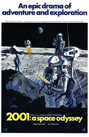
2001 movie posterIn 1964, Clarke and Kubrick teamed up to produce a film based on one of Clarke’s short stories (“The Sentinel”) which would be a “Journey Beyond the Stars” (an early title of the film). As Clarke notes, many poor films were written at first as screenplays, and many awful novels were written as “novelizations” of films, thus both collaborators decided to flesh out the story as a full-fledged novel while simultaneously creating the film; this was beyond ballsy given their early projections of going from practically nothing to a finished novel and feature-length motion picture released simultaneously in only two years. In a comfort to those tackling impossible projects, two of the greatest writers actually worked for four years, and they would finish barely one year before the first lunar landing in 1969, an event which would define in real life whether their film would come across as futuristic and timeless or dated and hokey compared to real astronautical technology.
As Clarke churned out the novel, Kubrick enlisted a virtual army to begin set and model construction for the film. An oft-cited example of the frenetic pace of production: Clarke would often write chapters and present them to Kubrick, who would revise and film scenes, whereby Clarke would view the rushes (rapidly developed film) from a day’s filming and alter the novel accordingly.

In terms of vision, the two were not totally dissimilar, but both had separate agendas. Clarke’s characters in the novel are thinking creatures of emotion in a universe of wonder, while Kubrick sought to portray sterile and emotionless characters in a world of strangeness punctuated by moments of sheer terror. It was ultimately Kubrick who unintentionally got the jump on Clarke, whose novel was released a couple months after the film and was, much to Clarke’s chagrin, sometimes confused for a “novelization.”

I tried my best to explain to my students that comparing the novel and film is akin to apples and oranges, but without a full film curriculum possible (the course was a mere six weeks to explore all of sci-fi) the message was sure to fail. In any case, there is much to be learned by reading the novel and watching the film in succession, including a whole host of illuminations regarding the plot that are otherwise inaccessible to most casual film watchers.

The film itself is a technical masterwork, showcasing attention to detail and visual effects craftsmanship that are unparalleled in any period piece and still hold up far better today than many CGI visual effects produced three or more decades later. As mentioned above, Kubrick had specialists including draftsmen, architects, aerospace engineers, and consultants who were involved in the fabrication of NASA’s period technology all working on building the Discovery, the monolith, and other set pieces. Additionally, he and Clarke poured over the latest technical publications. As a result of his efforts, Kubrick was presented with an Academy Award for Best Visual Effects. Sweeping camera shots paired with the masterful manipulation of the models, such as the docking of the the earth shuttle with the international space station, all set to Strauss’ Blue Danube, are still beautiful and breathtaking to this day.

Kubrick was obsessed with producing a film which was not immediately dated by technological advancements of the very near future. With the spectacular technological and logistical feat of the lunar landing looming on the horizon, such a rapid deprecation of the film’s technology was a very real possibility.

Simultaneously, Kubrick was paradoxically adamant that the film not be considered a prediction, but rather a fable, and be interpreted as such. The clash of a hard science fiction masterpiece in Clarke’s novel, which contains a prescient level of technical detail about space travel, and Kubrick’s stripped-down film, which offers very little in the way of technical exposition, tethers the two works together in provocative and oftentimes frustrating ways: the novel reader can recognize the subtly silent exposition of the scenes, while the period audience and many critics were able only to gawk at spectacular visuals as their Dionysian drive for plot acquisition is inhumanely stifled by Kubrick’s minimalist aesthetic.

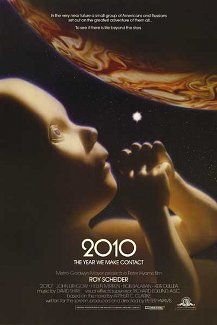
2010 movie posterBy contrast, 2010: The Year We Make Contact looks laughably dated in the 1980’s. The mod and futuristic set design and spectacular visual effects afforded by the painstakingly constructed models in 2001 are long gone, replaced by cheap looking reproductions and technology which looks very much lifted out of War Games (no disrespect). While the plot picks up somewhat near the original, the film is very much dependent on typical cliches. Roy Scheider as Dr. Floyd from the first failed mission has to team up with the hated Soviets to recover the Discovery before it drops out of orbit into Jupiter. The film lazily borrows the score from Kubrick’s film, inserting clipped segments of Strauss’ Also sprach Zarathustra which was used to such stunning effect in the first film as merely an abbreviated leitmotif for the appearance of the monolith. Additionally, the film leans on the crutch of voiceover, with Scheider reading one-sided letters home to his wife which update the plot action on the mission to Jupiter. In short, it replaces Kubrick’s visionary aesthetic with a more crowd-pleasing, action-oriented plot.

As with most science fiction that we are used to seeing, there is light introspection coupled with an apparent lack of technical detail. While Kubrick gives us a visual essay on how space travel might work based on Clarke’s detailed writings and research, 2010 gives us just enough explanation to gloss over the extant problems so that the filmmakers can progress the meandering plot. There are incoherent details presented, such as squeeze-bottle liquid containers which would make perfect sense in a zero-G atmosphere, but make no sense when the characters are firmly planted on the ground. Come to think of it, it’s not clear how the gravity works on the Soviet spaceship. Additionally, HAL, an integral and complex character from the first film, is spoken to much like a child (or dog) in this film, and is seen only as an obstacle which must be traversed to escape the impending danger at the end of the plot line.

The most satisfying part of 2010 comes when Bowman’s character from the first film reappears to deliver a message from the non-corporeal star beings and warn the American crew marooned on the Discovery of their dangerous position near Jupiter which (SPOILER) will become a second sun in the now binary Sol system, with all of Jupiter’s moons now (possibly?) habitable for human life (I haven’t read the second book).

As Bowman delivers his information, he transitions through the various life stages we originally saw in the final act of 2001. He walks the deck of his former ship, and even converses with HAL, apparently more serene than his last embittered encounter. Having transcended corporeal existence, he can now understand HAL’s actions and even, possibly, forgive him (if such emotions are even in the purview of his new existence). It’s hard to say whether I appreciated this portion of the film as a part of 2010 or as a satisfying resolution to the enmity which defined their parting in 2001, though I feel the later is probably much more likely.

Recently, I’ve been thinking about how sequels (or prequels) are a difficult matter to negotiate, and the difficulty grows proportionately with the gap in years between installments as film technologies and cultural zeitgeist (co-)evolve. While 2010 is not a “bad” film, it is hard to read both films as related other than the common characters and plot elements. In the ways that really matter, they couldn’t be further apart.

“Ever dance with the devil in the pale moonlight?”

I was reading a Chicago Tribune article entitled “Gang Violence Erupts in Lincoln Park” and I thought of this quote read by the immortalized Jack Nicholson in Batman (1989). My title was mostly inspired by the line from a dogwalker at the end of the piece who reconsiders walking her dog in the park at night: “Why dance with the devil?”

The epidemic of gang violence is now becoming fashionable to discuss by news outlets as it outpaces the benchmarks for shootings and killings set in previous years. Last year saw a glut of shootings and the much acclaimed debut of The Interrupters (2011) which profiled interventionists from Cease Fire who attempt to diffuse potential shootings (watch it here). Last year also saw the “appearance” of what the media incorrectly named “flash mobs” (later revised in some news outlets to “flash thugs”) who performed mass robberies/beatings and then dispersed.

I see the connection here because “flash thugs” have long been a problem on the south side of Chicago. I would link to news articles to prove this, but the south side receives hardly any coverage for this type of crime, so I couldn’t find anything (apart from a few quotes from longtime U.S. Representative Bobby Rush).

The “flash thugs” phenomenon only gained notoriety for most people (including myself) after merchants and pedestrians/commuters were targeted in/near Streeterville, the Loyola Water Tower campus, and the Mag Mile area.

It seems like gang violence, apart from statistical comparisons, is destined to the same obfuscation unless it spreads to wealthy, white, North side communities (apart from the perennially ignored Uptown and the ghost town that was Cabrini, now referred to by some as the “Park Side of Old Town” [what a laugh]).

What prompted the above title is the reaction by Gotham City officials in most of the Batman series films. The super criminals recognize that to garner attention to their demands, they must become brazen and target persons and areas of high profile. Perhaps we are starting to see life gruesomely imitate art, in that our own government and police will be spurred to stem systemic violence this year as it invades the downtown transit system, the North side, and continues to worsen on the South side as a result of high temperatures and high unemployment. Then again, perhaps not.

Clever Tweetbots

Earlier in the week, I played this Radiolab segment “Clever Bots” for my students in my summer science fiction course. We were discussing artificial intelligence after reading Neuromancer by William Gibson and the segment discusses robots that approach what Alan Turing described as the threshold for intelligent machines (the ability for a machine to converse with a human and for that human to be unable to distinguish between the machine and another human around 30% of the time–the “Turing test”).

I was discussing language games and computer programming with Nicole earlier today. I was telling her about the interview in the above segment of Sherry Turkle, a professor at MIT, concerning a program named ELIZA: a language game program ca. 1966 that used natural language processing (NLP) to mimic the role of a therapist practicing Rogerian psychotherapy (a form of talk therapy), only a little too closely for the creator’s comfort. Reportage on the program speculated that people would go to phone-booth-like installations to receive therapy rather than a human psychiatrist. The creator, Joseph Weizenbaum, was greatly disturbed by the artificiality of this type of interaction.

When I saw James Schirmer, professor of English and prolific tweeter playing with the app That can be my next tweet, I had to give it a shot. Apparently it is a kind of language game that searches your past Twitter posts and assembles fragments of each post based on their parts of speech (presumably using NLP) into a semi-coherent and incredibly hilarious melange of random babblings. Only about one third of the tweets make any sense, but here are some of the funnier tweets the app generated, and I posted:

And my favorite, which I admittedly modified slightly by omitting a few random letters and characters at the end: