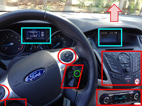
This was probably one of the worst designed user interfaces I have ever experienced. I rented an economy car for the conference I was at last week and I was upgraded to this car, the make of which is readily apparent from the photo and the model of which is a synonym for concentration / what you do to a projector to make the image clear. Have a look at the annotated user interface: displays are bracketed in blue, buttons in red, and the red arrow indicates where a whole other bank of buttons was located out-of-frame on the roof of the car). Click for a larger image.
Having done some research on eye-tracking devices (the research tool that you strap to someone’s head to see exactly where they are looking at on a display), I know that the human gaze can only truly focus (no pun intended) on an area about the size of a quarter (the $0.25 coin) held at arm’s length. So while this photo is a pretty good representation of my view from the driver’s seat, you can imagine the focus area as that green circle towards the bottom center.
That green circle has another meaning, as it highlights the button you push to engage the voice command function in this car. I tried using this function to turn on the radio as I drove to the airport, as pressing the “RADIO” button on the large center console in the right of the photo does nothing (I missed the tiny on/off toggle label on the button protruding from that console).
That voice function has absolutely no natural language processing ability, and it also only controls a finite number of car functions that it lists off after you fail to issue a recognized command. It apparently thought I wanted to make a call, and kept asking me for a number. I am a tightwad, and I can only imagine the cost of making a call from a rental car, so I was frantically trying commands like “OFF!” and “Never mind!” that my iPhone recognizes, but this car jovially disregarded as it continued asking me for clarification. I was also driving on unfamiliar roads at the time and missed my turn, making the situation a complete debacle as I awkwardly tried to turn around in a shopping mall parking lot while arguing with my car, holding up traffic and probably enraging the local drivers.
So here are some unorganized observations. First, there should only be one display for the driver to look at: the one between the tachometer and speedometer on the left. The center display is a terrible distraction. Why the hell there are directional pads on either side of the steering wheel is a mystery; perhaps they are trying to accommodate right-handed and left-handed drivers? Either way, you cannot keep your eyes on the road when you are trying to move a cursor on that display. The bank of controls on the ceiling (where the arrow is pointing) operates the interior lights, sunroof, and other features, and is equally difficult to operate while driving. There are also thumb operated switches on either side of the steering wheel that operate the phone, stereo, and cruise control. These are better, and maybe one grows accustomed to the functionality over the course of ownership and with some practice (you need to hold down buttons in different time intervals apparently to select and execute the desired function).
Add to that the odd placement of some things: the door lock is a button on the center console (the one with the small orange LED), which was nearly impossible to find. On either side of that are switch-style buttons with no other label than a short line and a slightly curved line that had no function as far as I could determine (they did not control the mirrors as I first thought; there was another directional pad/switch combo on the door handle that did this job).
While in the car, I had the impression that I was piloting an F-22. I usually laugh at people who are afraid to “break” systems or who become button shy, but I was humbled by my experience in this vehicle. My own car is a warhorse with very few frills, so getting in this relatively high-tech machine was an assault on the senses (I say “relatively” because I know there are much fancier cars with even more buttons). The interface design almost assumes a passenger (or dare I say, co-pilot) to operate and monitor systems while one drives. Doing so on your own as the driver is perilous (especially when you are driving a rental in an unfamiliar city). I should note that I was also trying to use my phone’s navigation function at the time, which only added to my distractions.
The answer to the cognitive overload I experienced is obviously that little green circle. If the computer actually processed natural language and not preprogrammed speech acts, and if it controlled more of the car’s auxiliary functions (other than the primary function of driving) you could eliminate two-thirds of the buttons in those red boxes.
